San Diego soccer fans were in for a treat as the city’s Major League Soccer (MLS) expansion team unveiled its official name and logo in preparation for its debut in 2025.
The team proudly donned the moniker “San Diego FC” and introduced a new brand identity that was designed to reflect the diversity of the city’s communities.
“The Flow” – An Emblem of Unity
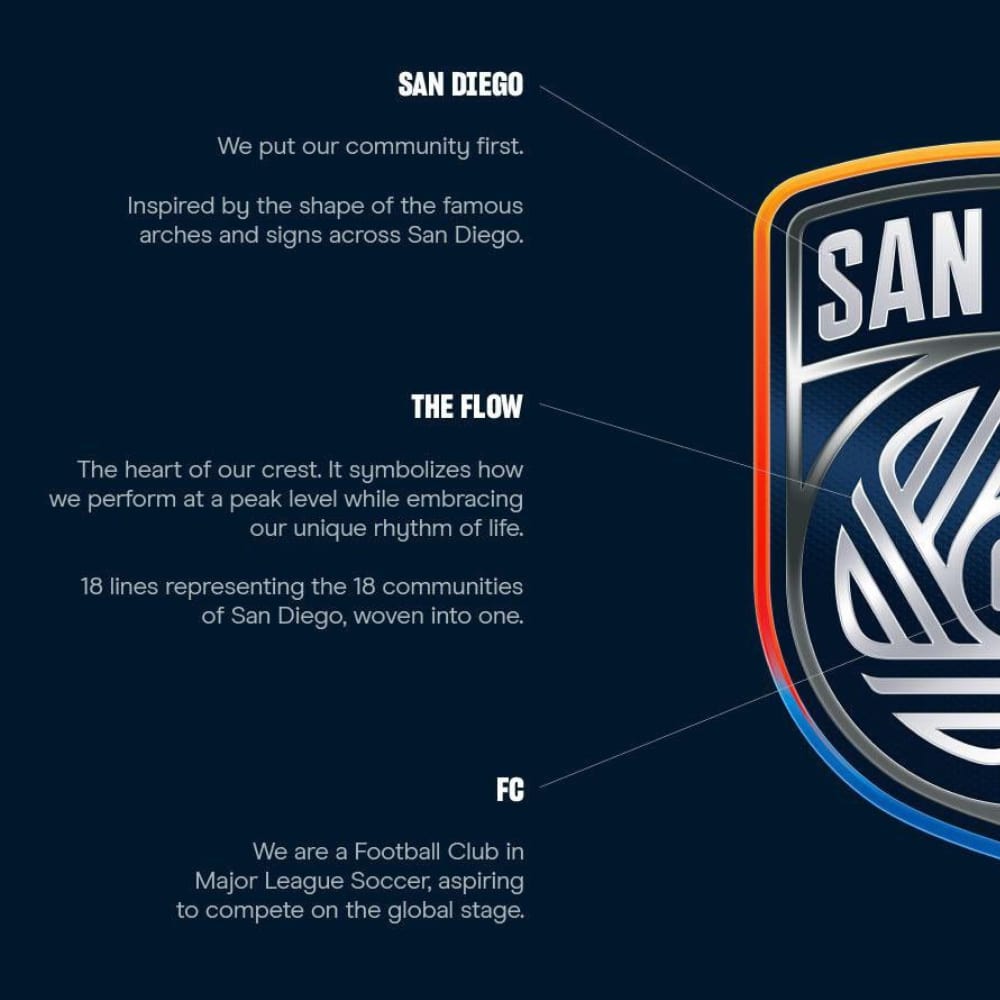
“The Flow”, the centerpiece of this brand identity, is a crest consisting of 18 lines representing the 18 unique communities making the vibrant picture of the county of San Diego.

The words ‘San Diego’ are elegantly inscribed on the crest’s peak, just like on signs all over the city. It has a shield-shaped crest indicating the strength and harmony of the society. The chrome finish also uses the hues of San Diego to enhance the exterior layers of the emblem.
Mixed Reactions and Creative Critiques
Fans were not impressed by the logo. It was unveiled at the tail end of San Diego Loyal’s final season in the United Soccer League (USL), which left some fans conflicted. Some people loved the symbolism of “The Flow” representing the various communities in the city while others were quick to criticize and label it unimaginative.
It wasn’t long before the new MLS club’s logo became an object of public debate. Many felt that they did not get the soul and pride they expected to see such branding. The wave of backlash has left soccer enthusiasts hoping that it may convince the team’s decision-makers to reconsider the logo! Fingers crossed that any replacement logo gets a few more smiles than frowns.